Product
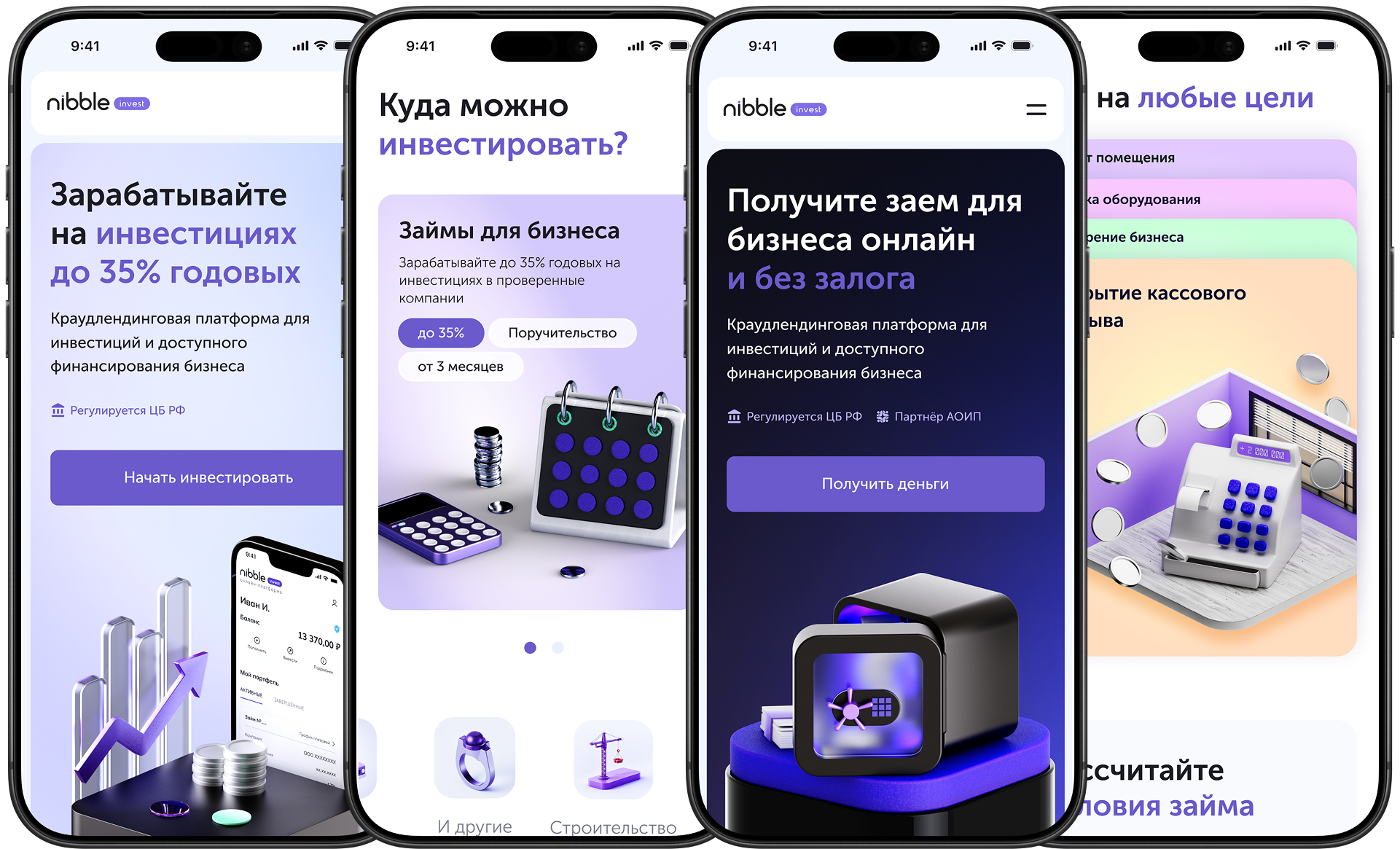
Nibble Invest is a P2B platform connecting private investors and small businesses. Investors earn up to 35% annually, while businesses get unsecured loans.
Crowdlending platform for investors and borrowers
Final designs are complete and handed off to the team.
CONTEXT
Nibble Invest is a P2B platform connecting private investors and small businesses. Investors earn up to 35% annually, while businesses get unsecured loans.
Marketing, analyst, and product owner.
Redesign completed, production not launched yet.
Product architecture, user flows, UX/UI, prototyping, design system, and development support.
Post-launch analytics, backend, and marketing strategy.
PROBLEM
The old website tried to speak to two completely different audiences at once: investors and borrowers, within one navigation structure.
PRODUCT GOALS AND SUCCESS CRITERIA
Attract more borrowers and increase registration conversion. The effect on CAC should be measured after launch.
POST-LAUNCH METRICS
Separating the funnels makes it possible to direct paid traffic to relevant landing pages and creates a foundation for reducing CAC after launch.
On both pages, the Central Bank license and partners were moved into the hero. For investors: live platform stats. For borrowers: “150M RUB already issued to businesses” and “7 days average term.”
I replaced the account icon with an explicit “Log in” button. Added the “I am an investor / I am a borrower” role switcher, reduced the path from 4 screens to 2, and removed duplicate CTAs.
DESIGN STAGE OUTCOMES
The redesign has not launched in production; final mockups are complete and handed off. Project artifacts:
TAKEAWAYS
I would push for a faster production launch to test hypotheses on real traffic, not only in tests.